


















Lesson 7 of 49 · Looking at Art
The Elements of Art: Line, Shape, Color, Value, Texture, Space
Learn the six elements of art with named examples from Hokusai to Caravaggio, plus a color mixer and a line-mood explorer you can play with.
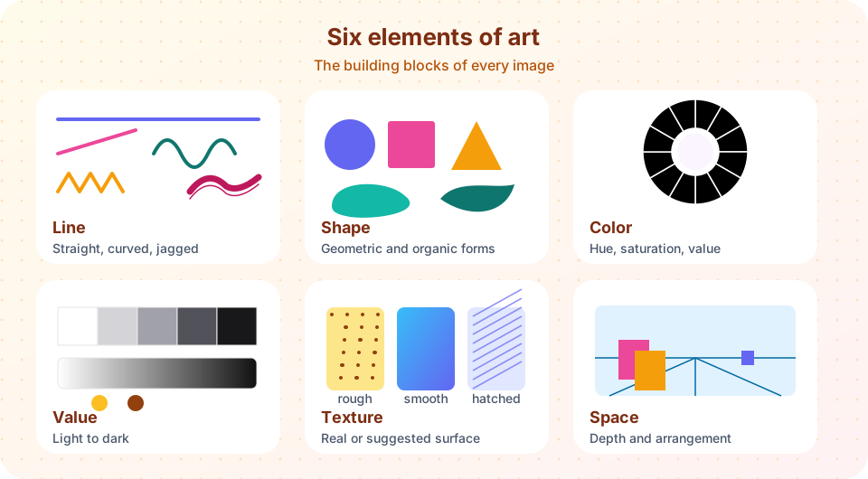
Every picture, sculpture and building is built from a small set of visual ingredients. Teachers often call them the elements of art: line, shape, color, value, texture and space. A cook who knows salt, acid, fat and heat can explain why a dish works; an art historian who knows the elements can explain why a painting feels calm, urgent, solid or dreamlike. This lesson names each element, shows how artists have used it, and gives you words to describe what you see.
Do not treat the list as a rulebook. Artists did not set out to "use line"; they set out to make a tiger look fierce or a church look heavenly, and the elements were their means. But once you can name the means, you can follow the argument of a work much more precisely.
What you will learn
- The six elements of art and how to describe each one.
- How artists use each element to create mood, emphasis and depth.
- Words for color: hue, saturation, value, warm, cool and complementary.
- How to move from naming an element to explaining its effect.
Key terms
- Line: a mark with length that is much greater than its width, or an edge between two areas.
- Shape: a flat area with a boundary. When it has volume it is called a form.
- Hue: the color family, such as red or blue. Saturation is its intensity. Value is how light or dark it is.
- Texture: the surface quality, actual or suggested.
- Negative space: the empty area around and between the main subjects.
Line
A line can be a drawn mark, an edge where two colors meet, or an imagined path that your eye follows. Lines come in several characters. Horizontal lines feel calm and stable, like a horizon. Vertical lines feel upright and grand, like a column. Diagonal lines feel dynamic, as if something might fall or rush. Curved lines feel flowing and soft, and jagged lines feel nervous or sharp.
Look at Hokusai's Great Wave off Kanagawa (about 1831). The curling claws of the wave are built from strong curved lines that sweep across the sheet and bend around the tiny peak of Mount Fuji. Compare them with the thick straight outline in many Egyptian tomb paintings, which keeps figures clear and steady. A line can also be expressive: in Vincent van Gogh's The Starry Night (1889) short, thick strokes swirl across the sky, and their direction makes the night appear to move.
Two terms are worth learning. A contour line outlines an object. Implied line appears where nothing is drawn: a row of figures all looking in one direction creates a line of attention, and the outstretched arm in a painting can point your eye like an arrow.
Shape and form
A shape is an area with a boundary: a circle, a square, a blob. Shapes fall into two broad families. Geometric shapes (circles, squares, triangles) have regular edges and feel ordered, human-made and stable. Organic shapes (like leaves, pebbles or clouds) have irregular curves and feel natural and alive.
Artists can work with shapes alone. In 1915 the Russian painter Kazimir Malevich exhibited Black Square, a plain black quadrilateral on a white ground, as a deliberate end-point of representation. Late in life Henri Matisse, unable to stand at an easel for long, cut out organic shapes from painted paper and arranged them into compositions such as The Snail (1953), a spiral of colored rectangles. In sculpture and architecture, shapes become forms: solid volumes you can walk around, such as the sphere of a dome or the cylinder of a column.
Positive and negative space
Positive space is what the subject occupies. Negative space is the area around it. A classic exercise is to draw the gaps between the legs of a chair instead of the chair itself, which forces you to see true proportions. Many Japanese woodblock prints use large areas of empty space, which gives the main subject room to breathe. In Henry Moore's sculptures, holes pass through the figures, making the negative space as meaningful as the stone or bronze.
Color: hue, saturation and value
Color is the element people react to first and talk about least precisely. Three words help.
- Hue is the color family on the wheel: red, orange, yellow, green, blue, violet.
- Saturation (also called intensity or chroma) is how pure or dull a color is. A saturated red is vivid; mixed with gray it becomes muted.
- Value is how light or dark a color is, regardless of hue. Yellow is a light value; deep blue is a dark one.
The traditional color wheel arranges hues in a circle. Complementary colors sit opposite each other (red and green, blue and orange, yellow and violet). Placed side by side they vibrate and make each other look brighter, which is why Van Gogh liked painting orange against blue. Analogous colors sit next to each other (blue, blue-green, green) and feel harmonious. Warm colors (reds, oranges, yellows) seem to advance toward the viewer, while cool colors (blues, greens) seem to recede, a trick painters use to create depth.
Color also has a history. In 1666 Isaac Newton passed sunlight through a prism and showed that white light contains a spectrum of colors. In the nineteenth century the chemist Michel-Eugène Chevreul studied how neighboring colors alter each other, an idea that influenced the Impressionists and Georges Seurat. And before the synthetic era, some pigments cost a fortune: ultramarine, made from ground lapis lazuli mined in Afghanistan, was reserved for important details such as the Virgin's robe in many medieval and Renaissance paintings. When a painter used a lot of it, that was a statement of cost and devotion.
Squint at a painting or blur your eyes. What remains are the big masses of light and dark. If those masses are interesting, the painting works at a distance as well as up close.
Value and light
Value describes light and dark by itself, and artists use it to model forms: a sphere looks round because one side is lighter and the other darker. Strong contrast between light and dark is called chiaroscuro (Italian for "light-dark"). Caravaggio, working in Rome around 1600, pushed it to the extreme in The Calling of Saint Matthew (about 1599 to 1600), where a beam of light enters a dark tavern and picks out the faces. By contrast, a high-key picture is mostly light and a low-key picture mostly dark.
A useful test: take a color image and convert it to gray. If it still reads clearly, its structure depends on value rather than hue. If it turns to mud, its structure depended on color contrast.
Texture
Texture is how a surface feels or appears to feel. Actual texture can be touched: the thick, ridged paint of Van Gogh's Sunflowers, called impasto, or the rough stone of a Gothic wall. Visual (implied) texture is an illusion: a painter can make a velvet curtain look soft or a polished armor look hard. Dutch still-life painters of the seventeenth century, such as Willem Kalf, were famous for their illusions of glass, silk and lemon peel. When you look at a work, ask where the texture is smooth and where it is rough, and why the artist might have made that choice.
Space
Space is the illusion of depth on a flat surface, or the actual space in which a sculpture or building sits. Painters have used several devices to suggest depth:
- Overlap: an object in front covers part of one behind it.
- Size: smaller objects seem farther away.
- Vertical position: higher on the page often reads as farther away.
- Atmospheric perspective: distant objects become paler and bluer, as in a hazy landscape.
- Linear perspective: parallel lines appear to converge toward vanishing points, a system developed in Renaissance Italy that Chapter 4 explores.
Not every culture used all these devices. Many Egyptian, medieval and East Asian artists organized space by meaning or by stacking figures in rows rather than by a single viewpoint, and that was a deliberate choice, not a lack of skill.
From naming to explaining
A weak description says, "The painting uses lots of color." A strong one says, "Saturated reds in the foreground advance against cool, pale blues in the distance, which creates depth and focuses the eye on the central figure." Notice the pattern: element, specific observation, effect. Use that three-step sentence as your template whenever you write about a work.
Common misconceptions
"Realistic means skillful, and flat means primitive." Flatness may be a choice. A stylized outline can be harder to make well than a realistic shading.
"Primary colors are red, yellow and blue, full stop." That is the traditional painters' set, but printers use cyan, magenta and yellow, and screens mix red, green and blue light. Pigment mixing and light mixing work differently.
"Value and color mean the same thing." Value is lightness or darkness; color (hue) is the color family. A black-and-white photograph has no hue but a full range of value.
Try it
Check your understanding
Quick check · 5 questions
of 5 answered You scored / 5 · perfect!
-
1. Which pair are complementary colors?
Complementary colors sit opposite each other on the wheel: blue and orange, red and green, yellow and violet. -
2. What is chiaroscuro?
The Italian word means light-dark. Caravaggio used it dramatically around 1600. -
3. What does value describe?
Value is lightness or darkness. Intensity is saturation, and the color family is hue. -
4. Which of these is an example of actual (physical) texture?
Impasto can be touched, so it is actual texture. Painted illusions are implied texture. -
5. Which is the best use of the elements in a description?
A strong description names the element, gives a specific observation and states the effect.
Summary
- The six elements are line, shape, color, value, texture and space; shape with volume is form.
- Line has character (horizontal, vertical, diagonal, curved, jagged) and can be implied.
- Color has hue, saturation and value; complementary pairs vibrate, warm colors advance and cool ones recede.
- Chiaroscuro uses strong light and dark; texture can be actual or implied.
- Depth comes from overlap, size, position, atmospheric perspective and linear perspective, but not every culture used all of them.
- A strong sentence names the element, the observation and the effect.
Track your progress
Create a free account to tick off lessons and pick up where you left off on any device.
of Art History lessons completed