


















Lesson 8 of 49 · Looking at Art
Composition and the Principles of Design
How artists arrange elements: balance, emphasis, rhythm, scale and unity, plus the triangle, diagonal and rule of thirds, with interactive overlays to try.
If the elements are the ingredients, composition is the recipe. Composition is the way the elements of a work are arranged within its frame or space: what goes where, how big each thing is, what is repeated and what stands alone. Two painters can use the same colors and subject and make completely different pictures, because they compose them differently.
Teachers often organize the ideas of composition into a short list called the principles of design: balance, emphasis, rhythm, scale and proportion, and unity with variety. As with the elements, these are not laws that artists obey. They are the questions artists answer, knowingly or not, every time they decide where to put something. Learning to spot how a work answers them is the fastest way to move from "I like it" to "here is how it works".
What you will learn
- The five principles: balance, emphasis, rhythm, scale and proportion, unity and variety.
- Common compositional patterns: triangle, diagonal, rule of thirds, central axis.
- Why claims about the golden ratio in famous works need caution.
- How to describe the composition of a real work in a few clear sentences.
Key terms
- Composition: the arrangement of elements within a work.
- Focal point: the place the eye is drawn to first.
- Symmetry: balance achieved by mirrored halves.
- Hierarchic scale: making important figures larger regardless of realism.
- Unity: the sense that all parts belong together.
Balance
A balanced composition feels stable, as if it will not tip over. There are three main types.
Symmetrical balance places matching parts on either side of an axis. Leonardo da Vinci's The Last Supper (about 1495 to 1498), painted on the wall of the dining hall of Santa Maria delle Grazie in Milan, is almost symmetrical: Christ sits in the exact center with a window and the vanishing point behind his head, and the apostles gather in four groups of three on both sides. The effect is calm and monumental, even though the moment depicted is one of shock.
Asymmetrical balance balances unlike things by their visual weight. A small bright red figure can balance a large pale gray mass, as a child on a seesaw can balance an adult if sitting farther from the center. Most naturalistic pictures use this kind, because real scenes are rarely symmetrical.
Radial balance arranges elements around a central point, like the rose windows of Gothic cathedrals or the petals of a flower.
Visual weight is affected by size, color (saturated and warm colors weigh more), contrast, texture and position. Even in an empty picture, an eye or a face adds weight, because humans look for faces.
Emphasis and the focal point
Emphasis is the deliberate drawing of attention to one part. Artists create a focal point through contrast (the lightest spot in a dark picture), isolation (one figure apart from a crowd), size, color (a single red coat in a blue scene) or by leading lines that point to it. Rembrandt often lit a face against a dark ground so that nothing could compete with it. When you look at a picture, notice what you saw first, and then ask what the artist did to make you see it first.
Rhythm and movement
Rhythm is the repetition of elements, with or without variation, creating a visual beat. A row of arches in a Roman aqueduct repeats evenly; a Baroque ceiling swirls in rising curves. Rhythm also guides the eye through a picture, which gives it movement. In The Raft of the Medusa (1818 to 1819), Théodore Géricault arranged survivors of a real shipwreck on a raft in two surging pyramids, with a strong diagonal from the dying at the lower left to the man waving at a distant ship at the upper right. The diagonal turns despair into hope and carries the viewer's eye along it.
Scale and proportion
Scale is the size of the work or of its parts relative to something else. Proportion is the relationship between parts. In the ancient Egyptian tradition, the pharaoh was often shown larger than his attendants, because status was shown by size. This is hierarchic scale, and it appears again in medieval art, where saints and kings can tower over ordinary people. Renaissance artists, by contrast, tried to scale everything consistently with distance. Neither approach is better. They serve different goals: one communicates rank, the other recreates what the eye sees.
Architecture and sculpture add a physical dimension: a statue meant to be seen from far below, like those on top of a cathedral, may have enlarged heads and upper bodies to look right from the ground.
Unity and variety
Unity is the feeling that everything belongs: a limited palette, a repeated shape or a consistent brushstroke can hold a picture together. Variety is the contrast that stops unity from becoming dull. Too much unity looks monotonous; too much variety looks chaotic. Most successful works strike a balance. Monet's Water Lilies rely on a unified, slightly blurred touch and a restricted palette of blues and greens, with variety supplied by tiny shifts of color and the floating lily pads.
Compositional patterns
Some arrangements appear again and again.
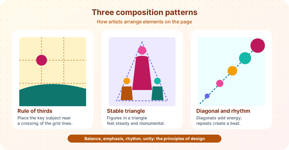
- The triangle (or pyramid): figures grouped so that their outer edges make a triangle, which feels stable and monumental. High Renaissance painters such as Leonardo and Raphael used it often for Madonna and Child groups.
- The diagonal: lines that cut across the picture create energy and direction, as in Géricault's Raft.
- The central axis: a vertical line down the middle, typical of religious scenes with a holy figure at the center.
- The S-curve: a gentle serpentine line that leads the eye through the picture, favored in Rococo art and landscape painting.
- Rule of thirds: dividing the frame into three equal parts both ways and placing key features at the intersections. It is a rule of thumb that became popular in the eighteenth century and is used heavily in photography. It is a guide, not a law: plenty of great works ignore it.
A note on the golden ratio
You may read that the golden ratio, about 1.618 to 1, secretly governs famous works such as the Parthenon or the Mona Lisa. The ratio itself is real: two quantities are in golden proportion when the larger divided by the smaller equals the sum of both divided by the larger. But the claims that artists consciously built famous works on it are mostly not supported by the documents, and the measurements often depend on where you decide to draw the lines. Some artists, such as the twentieth-century painter Salvador Dalí, clearly used it on purpose in particular works. For most others, treat the claim with caution, and note that if you draw enough rectangles over any picture, some will approximate 1.6.
Be wary of overlays. It is easy to make any picture "fit" a diagram. A good analysis uses a composition diagram to support an observation you can already see, not to prove a hidden formula.
Describing a composition
A useful template for a paragraph on composition is:
- Overall arrangement: symmetrical, asymmetrical, radial; vertical or horizontal format.
- Focal point and how it is made: contrast, isolation, color or leading lines.
- Movement: where the eye travels and what guides it.
- Relationship of parts: scale, grouping, space and how they support the subject.
Example: "In The Last Supper, perspective lines converge behind Christ's head, so the room itself points to him. The apostles form four groups of three, whose varied gestures break the symmetry and carry the eye outward and back." Notice that every claim is something a reader can check by looking.
Common misconceptions
"Composition is only for painters." Buildings, gardens, photographs and even museum displays are composed.
"Symmetry is boring." In the right context, it conveys order and authority. The Taj Mahal's symmetry is part of its calm grandeur.
"There is one correct composition." Artists often break the guidelines on purpose, and some of the most striking works are deliberately off-balance.
Try it
Check your understanding
Quick check · 5 questions
of 5 answered You scored / 5 · perfect!
-
1. Which composition is nearly symmetrical, with a central vanishing point behind Christ?
The Last Supper (about 1495-98) places Christ at the center, with perspective lines converging behind his head. -
2. What is hierarchic scale?
In Egyptian and medieval art, rank was often shown by size. -
3. What does asymmetrical balance rely on?
Different things can balance when their size, color, contrast and position give them equal visual weight. -
4. Which statement about the golden ratio is the most careful?
Some artists, such as Dalí, used it deliberately. For many others the claim rests on flexible measuring. -
5. Which describes a strong analysis of composition?
It names the pattern, shows where the eye goes and states the effect, all checkable by looking.
Summary
- Composition is the arrangement of elements; its questions are balance, emphasis, rhythm, scale and proportion, and unity with variety.
- Common patterns: triangle, diagonal, central axis, S-curve and rule of thirds.
- Balance can be symmetrical, asymmetrical or radial, with visual weight from size, color, contrast and position.
- Be cautious with golden-ratio claims and with overlays that "fit" anything.
- Describe composition by naming the pattern, the focal point, the movement and the effect.
Next: Media and Techniques
Track your progress
Create a free account to tick off lessons and pick up where you left off on any device.
of Art History lessons completed