


















Lesson 40 of 46 · Design Studio Projects
Presentation and critique
Learn to lay out a presentation board, plan a five-minute talk, and give and receive design criticism, with a board-area calculator and a time planner.
A design that nobody understands is, for most purposes, a design that does not exist. Architects spend years learning to draw and to build, but a surprising amount of a career depends on something else: explaining an idea to a client, a planning committee, a contractor or a jury, in a few minutes, in a way that makes them want to say yes.
At the end of each studio project, a student presents the work to a panel of critics at a review (also called a crit or a jury). It can be stressful, but it is a great teaching tool: it forces you to find the story of your project and exposes you to other minds. This lesson covers the two halves of that event: how to present, and how to take part in a critique, whether you are giving it or receiving it.
What you will learn
- How to lay out a presentation board with a clear hierarchy
- Which drawings to include and in what order
- How to structure and time a five-minute talk
- How to give a useful critique: describe, interpret, evaluate, suggest
- How to receive criticism without defending or collapsing
Key terms
Hierarchy: the visual ordering of a layout, so that the most important item is seen first.
Hero image: the single most persuasive image of the project, usually a perspective or a model photograph.
Narrative: the story that connects the drawings: problem, idea, solution.
Pin-up: a display of drawings on a wall for discussion; also the event itself.
Crit (critique): a discussion in which others examine the design and respond to it.
Designing the board
Think of a board as a poster with a job to do: win the attention of a tired reviewer who has seen 20 other projects. Most schools use sheets from the ISO A series, often A1 (594 x 841 mm) in landscape or portrait, or a series of smaller sheets. Within that area you must give the key information in the right order.
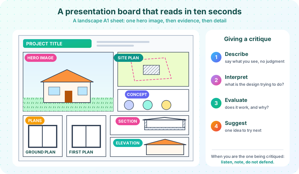
One hero image. About a third of the board, ideally, should be one strong image: a perspective of the building in its setting, an interior view, or a clear photograph of a model. It is what people see from across the room, and it conveys the character of the design.
Evidence around it. The supporting drawings prove that the image is not just a pretty picture. The usual set is: a site plan (to show context and orientation), floor plans (the arrangement of rooms), at least one section (the height, light and structure) and elevations (the appearance). Add a few concept diagrams (the idea behind the design) and, if useful, an axonometric or a detail.
Reading order. Western readers move left to right and top to bottom. Place the title and the hero image at the top left, the concept next to it, the site and the plans next, then the section and elevation. A numbered or color-coded sequence helps. Leave generous white space; a crowded board looks as if the designer could not decide what mattered.
Consistency. Use the same scale for all plans and the same scale for sections and elevations, show a north arrow and a scale bar on every plan, and apply the same line weights (see Scale, line weight and dimensions). Use at most two typefaces, one for headings and one for notes, in sizes that can be read from 1.5 meters. Limit the palette: a color that carries meaning (for instance public spaces in orange and private in blue) is far more effective than many decorative colors.
Honesty. A render is a persuasive picture, so do not let it hide problems. If the building has a large blank wall, the elevation should show it. If you add people and trees, scale them correctly: a person of 1.7 m beside a door of 2.1 m.
Planning the talk
The standard student review lasts five to ten minutes of presentation followed by discussion. A short talk has a clear structure, which you can remember as five beats:
- Context (30 seconds). Where is the project, and what was the brief? One or two sentences.
- Idea (1 minute). State the concept in a sentence and show the diagram that explains it.
- Design (2 minutes). Walk through the plan, section and key spaces, always saying why. Move from the outside in.
- Experience (1 minute). Describe what it would be like to arrive, move through and use the building, and show the hero image or model.
- Questions (30 seconds). Say what you are unsure about and what you would like critics to discuss.
Rehearse aloud, with a timer. Most speakers talk faster than they think, but they also try to include too much. If you have time for only one more sentence, use it to explain a decision rather than describing a room.
Point, don't read. Speak to the critics, not the board. Use the model: a model on a table that people can walk around is a powerful tool. If something goes wrong, such as a model breaking, keep talking.
The art of critique
A critique is a conversation about a design. Its aim is to improve the design and the designer, not to give a verdict. A useful structure, used in many studios, has four steps:
- Describe. Say what you see, without judging: "I see a courtyard surrounded by five rooms with one entrance on the south."
- Interpret. Say what you think the design is trying to do: "It seems to want to turn away from the road and gather around a quiet space."
- Evaluate. Say whether it works and why, tied to the brief and the design's own aims: "The courtyard works as the heart of the project, but the bedrooms on the north side will get little sun."
- Suggest. Offer one concrete idea to try: "Consider lowering the north wing to let low winter sun into the courtyard."
The structure keeps feedback specific and kind without being soft. Avoid vague statements ("I like it", "it doesn't work for me") and avoid attacking the person. Criticize the design, not the designer.
When you are being critiqued: listen, take notes and do not defend. It is natural to want to explain every decision at once, but arguing with critics wastes the time you have to learn from them. Ask clarifying questions. Thank people. Afterwards, sort the comments: some will be useful, some will conflict with each other, and some will reflect the critic's taste. You decide what to use, and the answer is in the brief and in your own aims. Often the best response to criticism is not to follow it exactly, but to understand the concern behind it.
When you are giving a critique: begin with what you find strong, because it helps the designer keep it. Ask questions that help the designer see ("What happens at the corner here?"). Be honest and avoid just talking about your own preferences.
Beyond the studio
The same skills apply in practice. A planning meeting, a client presentation and a competition entry are all presentations of an idea to people who must decide. Professionals add models, animations, materials boards and cost summaries, but the core remains: a clear story, supported by evidence, delivered with respect for the audience's time. Portfolios, the collections of work that architects show when applying for jobs, are also presentations, and they follow the same rules of hierarchy and clarity.
Common misconceptions
"More drawings make a better presentation." A board with fifteen small drawings is harder to read than one with five well-chosen ones; edit ruthlessly.
"A beautiful render replaces good drawings." Reviewers will ask for the plan and the section; the render only opens the conversation.
"A critique is a verdict." It is a conversation whose purpose is to improve the work; an enthusiastic critic who attacks an idea may be paying it the most attention.
"I should defend every decision." Explain your reasons briefly, but do not argue. You are there to learn.
Try it
First, a board-area planner. Decide how much of an A1 landscape board each element gets, and the calculator reports areas in square millimeters and percentages and checks that the total fits.
Press Run (or Ctrl + Enter) to see the result here.
Program input · what you'd type while the program runs
Type the answers before you press Run, one per line. Each time the program reads a line (with input()), it gets the next line from this box.
Second, a talk timer. Set how long you have and see how the five beats split. Then rehearse with the countdown.
Check your understanding
Quick check · 5 questions
of 5 answered You scored / 5 · perfect!
-
1. What is the hero image on a presentation board?
It gives the first impression and conveys the character of the design. -
2. Which is the first step of the critique structure in this lesson?
Describe what you see before interpreting, evaluating and suggesting. -
3. How should you respond when you are criticized in a review?
The review is a chance to learn; defending wastes it. -
4. A talk of 5 minutes gives 40 percent of its time to 'Design'. How long is that?
0.4 x 5 minutes = 2 minutes. -
5. Which is a good use of color on a board?
Color is most effective when it encodes information.
Summary
- A board needs a clear hierarchy: a hero image, then evidence (plans, section, elevation), then detail.
- Keep scales, line weights, north arrows and type consistent; leave white space.
- A short talk has five beats: context, idea, design, experience, questions.
- Critique in four steps: describe, interpret, evaluate, suggest.
- Receive criticism by listening and noting, not defending; decide afterward what to use.
Next: Chapter 8 review
Track your progress
Create a free account to tick off lessons and pick up where you left off on any device.
of Introduction to Architecture lessons completed