


















Lesson 38 of 46 · Learning Technology and Projects
Multimedia learning
How to design slides, videos and diagrams that fit working memory: dual channels, Mayer's principles, split attention, redundancy, animation limits and the learning-styles myth.
Most modern learning materials mix words and images: a slide with a diagram and a caption, a video with a narrator, a textbook figure with labels. Done well, a picture and words together teach more than either alone. Done badly, they compete for the same scarce attention and teach less than plain text. The difference is not taste. It follows from what you already know about working memory, and researchers, above all Richard Mayer, have turned it into a set of evidence-based design principles.
This lesson explains the theory in a few sentences, lists the main principles with the reasons behind them, and ends with a checklist you can use on your own slides and videos.
What you will learn
- The cognitive theory of multimedia learning and its three assumptions
- The main design principles and the reason behind each
- What split attention and redundancy are
- Why animations are not automatically better than static graphics
- Why "learning styles" are not a good basis for design
Key terms
Multimedia principle: people learn better from words and pictures than from words alone.
Split-attention effect: learning suffers when related information is separated so the learner must mentally combine it.
Redundancy effect: learning suffers when the same information is presented in several forms that do not need each other, such as narration reading identical on-screen text.
Signaling: cues that highlight what is important.
Dual coding: Allan Paivio's theory that verbal and visual information are processed in different, connected systems.
The theory in brief
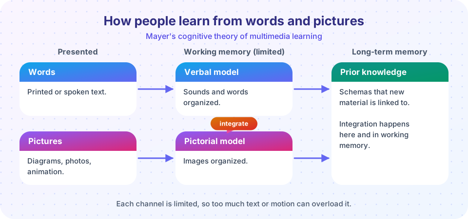
Mayer's cognitive theory of multimedia learning rests on three assumptions drawn from earlier research.
- Dual channels. People process verbal and pictorial information through partly separate channels. This is rooted in Paivio's dual coding theory (1971, 1986) and in Alan Baddeley and Graham Hitch's model of working memory (1974), which has a phonological loop for sounds and words and a visuospatial sketchpad for images.
- Limited capacity. Each channel can handle only a little at a time, as you saw in the cognitive load lesson.
- Active processing. Learning needs the learner to select relevant material, organize it into coherent models and integrate it with prior knowledge.
The design goal follows: reduce extraneous processing (things that waste capacity), manage essential processing (the unavoidable work of the content) and encourage generative processing (the active sense-making). The following principles are ways of doing this.
The principles
1. Multimedia principle. Words and relevant pictures beat words alone. A diagram that shows how a bicycle pump works plus an explanation gives learners a mental model that text alone makes harder to build. The picture has to be relevant: decorative clip art does not count.
2. Coherence principle. Leave out interesting but irrelevant material. Studies by Shannon Harp and Mayer (1998) found that adding entertaining but off-topic details, called seductive details, to a science lesson tended to lower learning. It steals attention from the main idea.
3. Signaling principle. Add cues that show what matters, such as bold key terms, arrows and highlighting, especially when the material is complex.
4. Spatial contiguity principle. Put words near the part of the picture they describe. In the split-attention effect, first described by Paul Chandler and John Sweller (1991), students had to mentally merge a diagram with a separate block of text, and learned less than students who saw the text integrated into the diagram. Labels on the parts beat a legend at the bottom.
5. Temporal contiguity principle. Present narration and its matching animation at the same time, not one after the other.
6. Modality principle. For a complex graphic, narration works better than on-screen text, because the verbal channel (hearing) and the visual channel (seeing) both share the load. Reading text and watching a picture overloads the visual channel.
7. Redundancy principle. Do not present the same words in speech and on-screen text together, when a graphic is also shown. The learner tries to read and listen at once, and the match is distracting. (Exceptions: when the text is very short, such as a few key terms, or the learner has no graphic to look at.)
8. Segmenting principle. Break a lesson into learner-paced parts, with a pause or a "next" button, so that processing can finish before the next piece arrives.
9. Pre-training principle. Teach the names and key features of the main components before the lesson that uses them.
10. Personalization and voice. A conversational style ("you can see that...") and a friendly human voice tend to work better than a formal style, in several studies, probably because they encourage the learner to engage actively. The effects tend to be modest.
Mayer and colleagues reviewed experiments for many of these principles, and most showed positive effects in laboratory conditions, usually with short lessons and immediate tests. The effects in long real-world courses are less well studied.
Animation and video
It seems obvious that moving pictures should teach processes better than still ones. Barbara Tversky, Julie Morrison and Mireille Betrancourt (2002) reviewed studies and found that animations were not consistently better than carefully designed static graphics, especially when the information in each was not the same. Animation is transient: by the time the next frame appears, the last one is gone, which can overload working memory. Control over pace (stop, rewind) and signaling help.
Studies of online videos also suggest something about length. In an analysis of several million video-watching sessions in massive open online courses, Philip Guo, Juho Kim and Rob Rubin (2014) found that engagement dropped for longer videos, and that personal, informal talking-style videos engaged more than polished studio ones. That was about engagement, not learning, but it fits the segmenting principle: shorter segments with questions in between are a good default.
A myth to avoid: learning styles
You will often hear that some people are "visual learners" and others "auditory learners", and that teaching should match the style. In a review for the journal Psychological Science in the Public Interest, Harold Pashler, Mark McDaniel, Doug Rohrer and Robert Bjork (2008) noted that the necessary kind of evidence would be a crossover result: visual learners should learn better from visual presentation and auditory learners from auditory, with the reverse for the other group. They found very little credible evidence of this "meshing" effect and some studies that contradicted it. People do have preferences, but a preference for a style does not mean better learning from it. What matters more is matching the presentation to the content: spatial material from diagrams, sequences from narration, and the principles above for everyone.
Putting it to use: a design checklist
The tool below turns the principles into a checklist you can apply to any slide, video or web page. It is a self-review aid and gives only a rough count, not a measure of quality.
The second demonstration is a toy model of a working-memory budget. All numbers are invented to illustrate the idea that extraneous load eats into the capacity left for learning. They are not measurements.
Press Run (or Ctrl + Enter) to see the result here.
Program input · what you'd type while the program runs
Type the answers before you press Run, one per line. Each time the program reads a line (with input()), it gets the next line from this box.
Common misconceptions
"More media is better." Extra pictures, animation or sound help only when they serve the content. Otherwise they add load.
"Reading the slide aloud helps people who prefer listening." Duplicated words compete with each other and with the graphic.
"Students learn best in their own learning style." The evidence for matching style to presentation is weak. Match to the content.
Check your understanding
Quick check · 5 questions
of 5 answered You scored / 5 · perfect!
-
1. What is the split-attention effect?
Chandler and Sweller found that integrating text into diagrams helped learners. -
2. Which design follows the modality principle?
Narration uses the auditory channel so the visual channel can process the diagram. -
3. Why might adding amusing but irrelevant details to a lesson reduce learning?
This is the coherence principle: seductive details compete for working memory. -
4. What did Tversky, Morrison and Betrancourt (2002) conclude about animation?
Animation is transient, and many comparisons were confounded by differences in content. -
5. What did Pashler and colleagues (2008) report about learning styles?
People have preferences, but the matching hypothesis has little support.
Summary
- Mayer's theory: two channels, limited capacity and active processing. Design should reduce extraneous load and support sense-making.
- Combine words and relevant pictures, cut decoration, put labels on the picture, use narration with graphics and avoid redundant text.
- Segment lessons into short parts that the learner can pace.
- Animation is not automatically better than static graphics.
- The learning-styles idea lacks good evidence. Design for the content.
Track your progress
Create a free account to tick off lessons and pick up where you left off on any device.
of The Psychology of Learning lessons completed