


















Lesson 55 of 122 · The Head, Metadata and SEO
Loading Resources Efficiently
Speed up your pages from the HTML head. Learn render-blocking resources, defer and async, preconnect, preload, modulepreload, prefetch and fetchpriority.
A web page is rarely a single file. The HTML pulls in stylesheets, scripts, fonts and images, often from several servers. How quickly the page appears depends less on how big those files are than on when the browser discovers them, in what order it fetches them, and what it has to wait for before it can draw anything.
You control a lot of that with plain HTML: a few attributes on <script> and <img>, and a handful of <link> hints in the head. This lesson explains how browsers load a page and which tools to reach for, without any build tools or frameworks.
How a browser loads a page
When the HTML starts to arrive, the browser does three things at once:
- The parser reads the HTML from top to bottom and builds the DOM.
- The preload scanner races ahead through the raw HTML looking for URLs in
<link>,<script>and<img>tags, so downloads can start before the parser gets there. - The renderer paints the page as soon as it is allowed to.
Two kinds of resources slow this down:
- Render-blocking resources. Stylesheets in the head block rendering: the browser will not paint the page until they have loaded, so you never see unstyled content flash by.
- Parser-blocking resources. A classic
<script>withoutdeferorasyncstops the parser. The browser must download and run it before it reads any more HTML, because the script might change the document.
Most of the techniques in this lesson either remove blocking or help the browser discover important files earlier.
Scripts: defer, async and modules
You met script placement in Adding JavaScript. Here is the full picture of how each kind of script behaves:
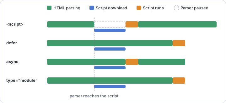
| Script | Blocks the parser? | When it runs | Order kept? |
|---|---|---|---|
<script src> |
Yes, while downloading and running | Immediately | Yes |
<script src defer> |
No | After the document is parsed, before DOMContentLoaded |
Yes |
<script src async> |
Only while running | As soon as it has downloaded | No |
<script type="module"> |
No | Like defer (or like async with the async attribute) |
Yes, unless async |
Rules of thumb:
- Use
defer(or a module) for your application code. It downloads early, never blocks, and runs in order once the DOM is ready. - Use
asyncfor independent scripts that do not touch your other code, such as some analytics snippets. deferandasynconly apply to external scripts. On an inline classic script they are ignored. Inline module scripts, however, are deferred automatically.
The demo below loads one script of each kind and records the order in which they run. The external scripts use data: URLs so the example works without separate files.
The classic scripts run exactly where they appear. The defer script and the module wait until parsing is finished and keep their order. The async script runs whenever its download completes, so its position can change from one run to the next. Press Run a few times and watch it.
Keeping CSS from blocking more than it must
Stylesheets are render-blocking on purpose, but you can limit the cost:
- Load only what the page needs. One small stylesheet beats five large ones. Avoid
@importinside CSS files, which makes the browser discover files one after another. - Use the
mediaattribute for styles that only apply sometimes. A stylesheet whose media query does not match is still downloaded, but at low priority and without blocking rendering:
<link rel="stylesheet" href="/css/site.css">
<link rel="stylesheet" href="/css/print.css" media="print">
<link rel="stylesheet" href="/css/wide.css" media="(min-width: 1200px)">
- Inline the critical CSS for the first screen in a
<style>element on very performance-sensitive pages, and load the rest normally. This is an advanced technique; measure before and after.
You will learn the ways of attaching CSS in Adding CSS to HTML.
Connecting early: preconnect and dns-prefetch
Before downloading anything from a new server, the browser has to look up its address (DNS), open a connection and negotiate encryption (TLS). That can take a few hundred milliseconds on a slow network. If you know the page will need a file from another origin, start that work early:
<link rel="preconnect" href="https://cdn.example.com">
<link rel="preconnect" href="https://fonts.example-cdn.com" crossorigin>
<link rel="dns-prefetch" href="https://widgets.example.net">
preconnectperforms the DNS lookup, connection and TLS handshake ahead of time.- Add
crossoriginwhen the files will be fetched in CORS mode, which is always the case for web fonts. A connection opened without it cannot be reused for those requests. dns-prefetchonly does the DNS lookup. It is cheaper, so it suits origins that are likely but not certain to be used.
Preconnect only to two or three origins that are critical for the first view. Every open connection costs resources, and browsers close unused connections after a short time.
Fetching early: preload
The preload scanner only finds URLs written in the HTML. Files referenced from CSS (fonts, background images) or added by JavaScript are discovered late. preload tells the browser to fetch such a file now, at high priority, because the current page will need it:
<link rel="preload" href="/fonts/inter-var.woff2" as="font" type="font/woff2" crossorigin>
<link rel="preload" href="/images/hero-wide.avif" as="image" fetchpriority="high">
- The
asattribute is required. It tells the browser what kind of resource it is (font,image,style,script,fetchand others), which sets its priority and lets the preloaded file be matched to the later request. - Fonts always need
crossorigin, even from your own server, because fonts are fetched in CORS mode. - For responsive images, use
imagesrcsetandimagesizeson the preload link, mirroring thesrcsetandsizeson the image (see Responsive Images).
Preload sparingly. Preloading pushes a file ahead of everything else. Preload too many files and you slow down the ones that mattered. If a preloaded file is not used within a few seconds, browsers print a warning in the console, which is a useful sign that the hint is wrong.
Modules: modulepreload
JavaScript modules import other modules, which the browser only discovers once the first file has arrived and been parsed. modulepreload lets you list important modules up front, so they are fetched, parsed and compiled in parallel:
<script type="module" src="/js/app.js"></script>
<link rel="modulepreload" href="/js/app.js">
<link rel="modulepreload" href="/js/router.js">
<link rel="modulepreload" href="/js/store.js">
Browsers are allowed, but not required, to fetch a preloaded module's dependencies automatically, so list the ones that matter.
Getting ready for the next page: prefetch
preload is for the current page; prefetch is a low-priority hint for a resource a future navigation will probably need, such as the next step of a checkout:
<link rel="prefetch" href="/checkout/shipping">
The browser fetches it when the network is idle and keeps it in its cache. Use it only when you are fairly sure the user will go there next, or you waste their data. Chromium-based browsers also support speculation rules (<script type="speculationrules">), a newer JSON format for prefetching or even prerendering whole pages; browsers without support simply ignore it.
Priorities and lazy loading
The browser assigns every request a priority. Two attributes let you adjust it.
fetchpriority (high, low or auto) works on <img>, <link> and <script>. Its classic use is the largest image in the first view, often called the Largest Contentful Paint (LCP) image, which browsers otherwise may start at a lower priority:
<img src="/images/hero.jpg" alt="Kayaks on a calm lake at dawn"
     width="1200" height="600" fetchpriority="high">
<img src="/images/carousel-3.jpg" alt="A campsite by the water"
     width="600" height="400" fetchpriority="low">
loading="lazy" on <img> and <iframe> delays the download until the element approaches the viewport. It saves bandwidth for images far down the page. Never lazy-load the main image of the first screen: it would only start loading after layout, which delays it. See Images and Iframes for more.
In this demo the first image loads right away at high priority, while the lazy images wait until you scroll toward them. Scroll slowly through the preview and watch the log at the top.
The lazy images load before they actually come into view: browsers start the download some distance ahead so the image is usually ready in time. Notice the width and height attributes too. They reserve space for each image, so nothing jumps around when it arrives.
Putting it together
Here is a head that applies these ideas, following the order from The head Element:
<head>
  <meta charset="utf-8">
  <meta name="viewport" content="width=device-width, initial-scale=1">
  <title>Lakeside Kayak Tours – Paddle North</title>

  <!-- Connect early to the origin that serves fonts and images -->
  <link rel="preconnect" href="https://cdn.paddlenorth.example" crossorigin>

  <!-- The one font the first screen needs, found late otherwise -->
  <link rel="preload" href="https://cdn.paddlenorth.example/fonts/body.woff2"
        as="font" type="font/woff2" crossorigin>

  <!-- Render-blocking, but small and essential -->
  <link rel="stylesheet" href="/css/site.css">
  <link rel="stylesheet" href="/css/print.css" media="print">

  <!-- Never blocks the parser; runs in order after parsing -->
  <script src="/js/app.js" defer></script>

  <meta name="description" content="Guided kayak tours on three northern lakes, for beginners and experienced paddlers.">
</head>
Measure, don't guess
Every hint has a cost, and the right set depends on your page. Before and after a change:
- Open the Network panel in DevTools (see Viewing Source and Using DevTools). The waterfall shows when each file was discovered, its priority and what it waited for. Throttle the network to a slow profile to make problems obvious.
- Run a Lighthouse audit in DevTools, or a lab test such as PageSpeed Insights. They flag render-blocking resources, unused preloads and a lazy-loaded LCP image.
- Watch the Core Web Vitals: Largest Contentful Paint (loading), Interaction to Next Paint (responsiveness) and Cumulative Layout Shift (visual stability).
The lesson Fast-Loading HTML returns to performance with a wider view: document weight, DOM size, compression and caching.
Check your understanding
Quick check · 5 questions
of 5 answered You scored / 5 · perfect!
-
1. Your main script needs the full DOM and must run after a helper library it depends on. Which attribute fits both scripts best?
deferscripts download in parallel, never block the parser, run after parsing and keep their order.asyncscripts run in whatever order they arrive. -
2. Why does a font preload need the
crossoriginattribute, even on your own server?A preload is only reused when its request mode matches the real request. Fonts use CORS mode, so the preload needscrossorigintoo. -
3. Which image should get
loading="lazy"?Lazy loading suits images far below the first screen. Lazy-loading the hero or logo delays the content people see first. -
4. What is the difference between
preloadandprefetch?Usepreloadfor late-discovered files the current page needs now, andprefetchfor files the next page will probably need. -
5. What does
<link rel="stylesheet" href="print.css" media="print">do on screen?Stylesheets whose media query does not match are still fetched, but at low priority and without blocking the first paint.
Summary
- Stylesheets in the head block rendering; classic scripts block parsing. Remove blocking you do not need.
- Use
deferortype="module"for application scripts andasynconly for independent ones. - Use the
mediaattribute so non-matching stylesheets do not block rendering. preconnect(withcrossoriginfor fonts) anddns-prefetchwarm up connections to other origins.preloadfetches late-discovered files the current page needs;modulepreloaddoes the same for JavaScript modules;prefetchis for the next page.fetchpriority="high"helps the main image;loading="lazy"is for images and iframes further down, never the first screen.- Measure with the DevTools Network panel and Lighthouse before and after every change.
Next lesson: The style Attribute.
Track your progress
Create a free account to tick off lessons and pick up where you left off on any device.
of HTML lessons completed